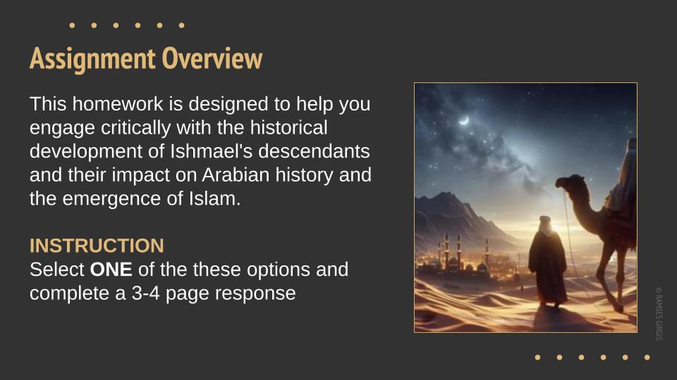
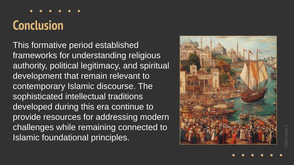
I was tasked with creating Google Slides for a professor teaching multiple courses. A fast-paced, constantly evolving project where content sometimes arrived a week before class—or worse, final editing hours before the class starts. Each deck had 30-40 slides.
The Challenges: Finding a system that worked for both of us.
- Fast-paced workflow – Content was always shifting, often last-minute.
- Professor = Former Engineer – Brilliant. Logical, methodical, but design? Not his strong suit.
- The Editing Mayhem – He’d dive into the slides, unintentionally dismantling the design.
- Ever-Changing Content – I had to constantly go back and fix everything (again and again).

The Solution:
- Google Docs for Content – instead of multiple emails and versions not always knowing which one is the latest. Professor sometimes forget to email me, or I simply miss the emails.
- Letting Go of Perfection – Sometimes, I had to accept that not every slide would be perfect. At the end of the day, the content was for the students, and clarity mattered most.


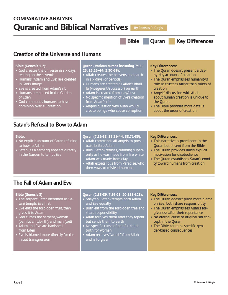
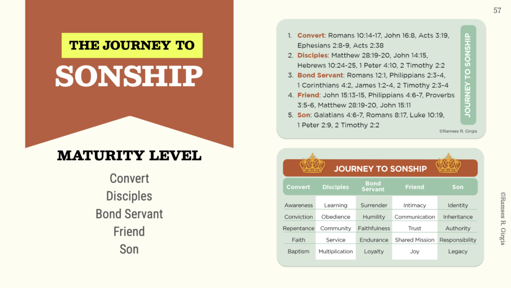
I also designed laminated sheets to accompany the slides. They fit beautifully, reinforcing key ideas while being portable and practical for students.
The students loved the slides and the sheets. And let’s be real: if there’s one group that’s brutally honest, it’s young people. They don’t hold back. Luckily, the feedback was overwhelmingly positive.(Phew!)
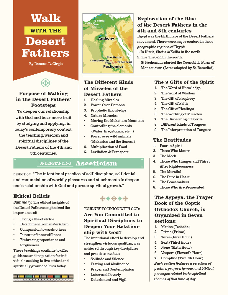
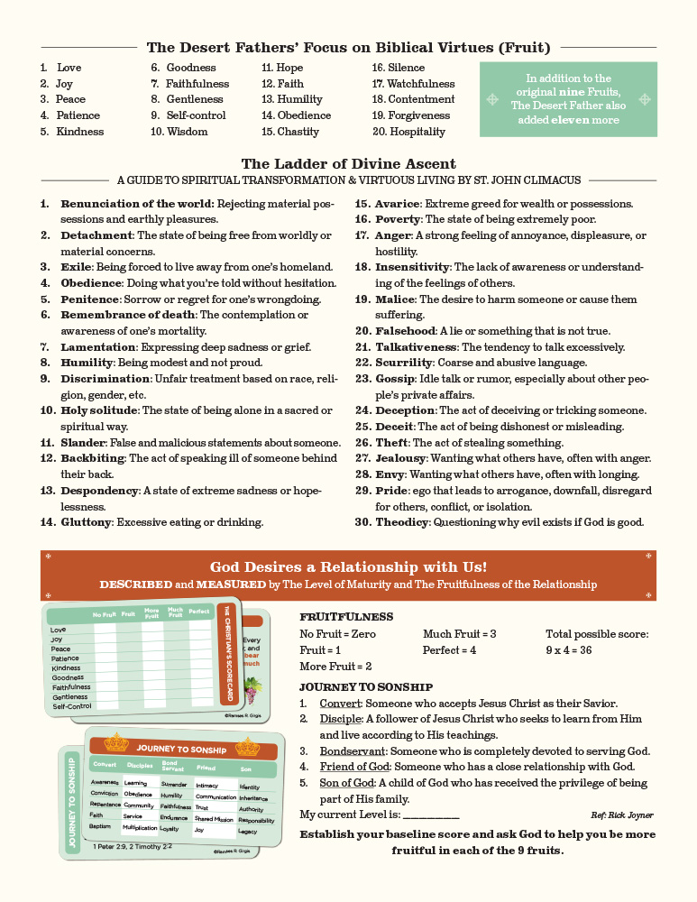
One student shared how the images in the slides brought the lesson to life, helping them connect theology to history in a way they never had before. Multiple students appreciated the visuals, and some even said the imagery inspired them to think about honoring and remembering spiritual figures in a new way.
This project wasn’t just about designing slides—it was about enhancing information through visuals, evoking emotion, and creating clarity. It was about navigating creative chaos and finding a workflow that works for me and the professor.