Every year, I handle the design for an annual event—including invitations, RSVPs, program books, PowerPoint slides, and the event website. I love making everything look polished and cohesive.
This time, though, our secretary decided to DIY the invitation. She sent it over, and—well, let’s just say it needed some TLC. The typography was all over the place, the format didn’t fit, and the sizing was off. So, I rolled up my sleeves and cleaned it up.
Before:
The original invitation had a DIY feel with mismatched typography, incorrect text sizes, and incomplete information. The overall design lacked clarity and consistency.
We went back and forth on font choices and placement, negotiating a balance between her vision and good design principles. In the end, I’m not completely thrilled with the final product, but we reached a compromise: the design is clean, the information is clear, and—most importantly—the client is happy.
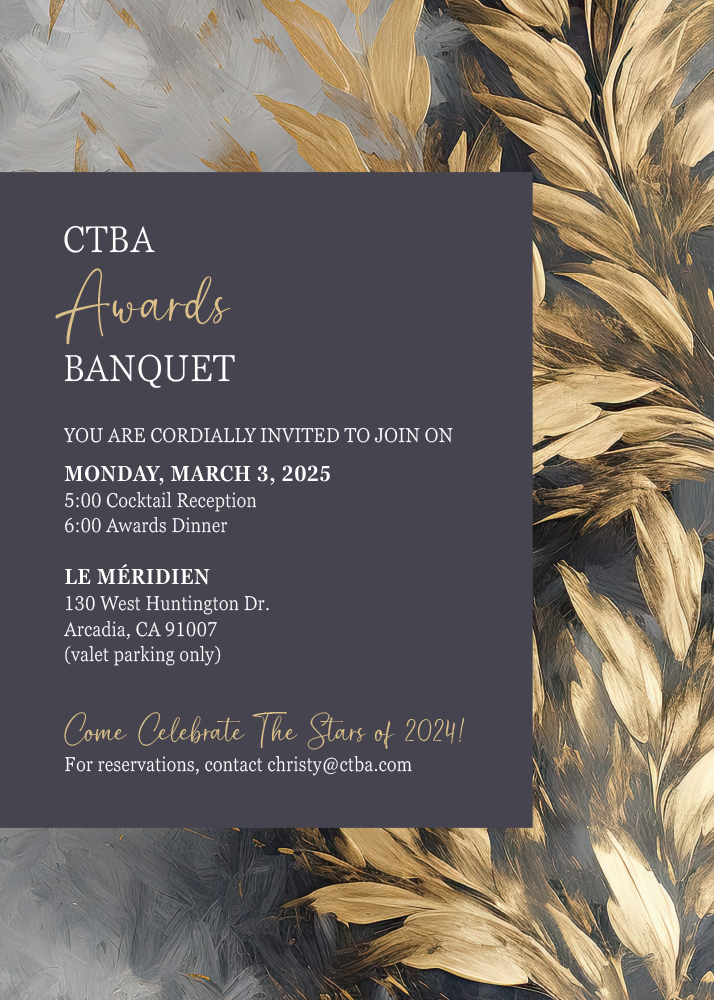
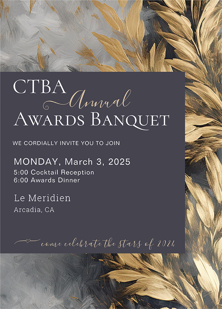
After:
The invitation met the necessary specifications for both an official event and a magazine ad. The typography is polished, text sizes are perfectly balanced, and all the required information is clear and concise.